Explore Data and Custom Reporting
Explore Data houses a multitude of viewable data, but this information can be winnowed down and sorted by using Filters and Formulas. This information once sorted, becomes a team's Custom Report(s). Teams can use the Explore Data feature to Build both Charts and Crosstabs to better view and share their data. These Charts and Crosstabs can be viewed as panels in the Dashboard Gallery.
Charts are built based on data from the Analysis Data table. You can then turn the chart into different chart types (Bar, Line, Curved Line, Pie, Heatmap, Gauge, and Scatter Plot). For instructions on how to Build a chart, refer to the Create a Custom Chart Use Case.
Crosstabs are built based on data from the Analysis Data table. Use Crosstabs to view two different dimensions at once. For instructions on building a Crosstab, refer to the Create a Custom Crosstab Use Case
Formulas are expressions that must contain data columns and can include constants, functions, and operators.
-
Columns are values that come from the data.
-
Their names are enclosed in square brackets, like [ShippedDate].
-
Depending on their data type, they may be used as text strings, numbers, and date/time values.
-
Constants are simply specific fixed values that you enter into a Formula.
-
Functions return values, usually computations based on columns and constants.
-
Operators do arithmetic and logical comparisons.
-
Logical comparisons must be used with Case statements.
To see instructions on building a formula, refer to the Create a Custom Formula Use Case
Create a Custom Report
To create a custom report, follow the steps below:
-
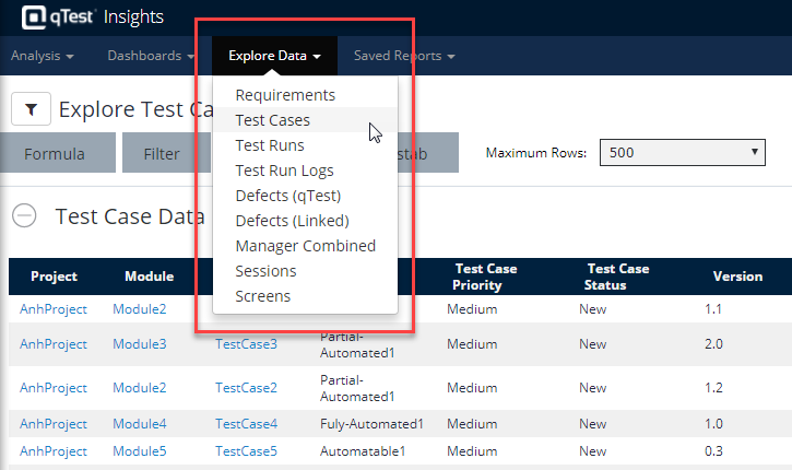
Open your qTest Insights instance and select the Explore Data tab.
-
The Explore Data drop-down menu displays.
-
In the drop-down menu, select the type of data that you want to view.
-
The data type selected will load the page, and now you can begin modifying the information that displays using the Global Filter.
Using the Global Filter
-
Select the Global Filter icon to expand and filter using the criteria options seen here. These values will vary based on the data type you originally selected. Therefore, not all options will be seen for each data type.
Projects
Test Cycles
Modules
Releases
Release Status Read this article for more information on using the Global Filter.
-
The Global Filter will refresh downstream with each data object you select.
-
Once finished, select Refresh Now. The Global Filter selections display on the Explore Data home page.
-
Optional: You can embed a report to an external application. Read this article for instructions on using the Embed Script feature.
Saving Custom Reports
-
Once you have selected the desired features and filters, select the Global Filter icon again and select Save Report.
-
In the Save Report dialog, name the report. This saved report is now available in the Saved Reports tab in the main Insights header.
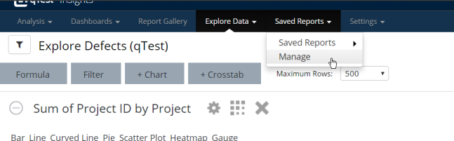
Share Saved Reports
-
You can share a saved report by accessing the report under Saved Reports, and selecting Manage.
-
Select the Action icon next to the saved report you want to share, and select one of the two options:
Schedule
Send Report Now
-
If Scheduling, fill in the proper information on the "Report Schedule" dialog and select Save.
Use Cases
Create a Custom Chart
In this example, we're trying to Build a chart for the number of Test Runs by Test Cycle.
-
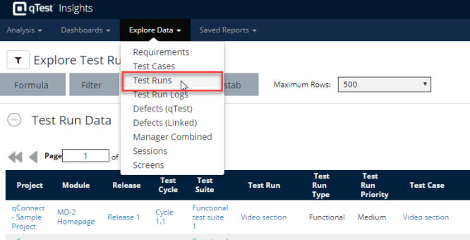
Select Test Runs under Explore Data section to open the Test Run Data page.
-
Select the +Chart icon to start building a chart of Test Runs by Test Cycle. Select the gear icon to open the report settings. Operators are listed below:
-
Label Column: Select Test Cycle
-
Data Column: Select Test Run ID value for this field to calculate the total number of Test Runs
-
Data Aggregation: Select Distinct Count
-
Compare Column: If you also want to show the latest results, select Latest Result.
-
Bar Orientation: Select Horizontal or Vertical
-
-
Select Generate Chart.
-
Optional: To view your chart as a panel in the Dashboard Gallery, select the 9-box icon. Define your Panel Title and Panel Description. Select Done.
Important
-
The Label Column will display the value of the field (i.e., if Test Case Type is selected, you get "Functional" and "Auto" displayed in the chart).
-
Data column will count the number of rows of the selected field by the label column (i.e., if Test Case Type is selected, it counts rows how many Functional rows, how many Auto rows, and therefore, it displays out the number).
-
Depending on bar orientation, these columns can represent either y or x-axis on a graph.
The chart is automatically generated whenever you change any field's value.
Create a Custom Crosstab
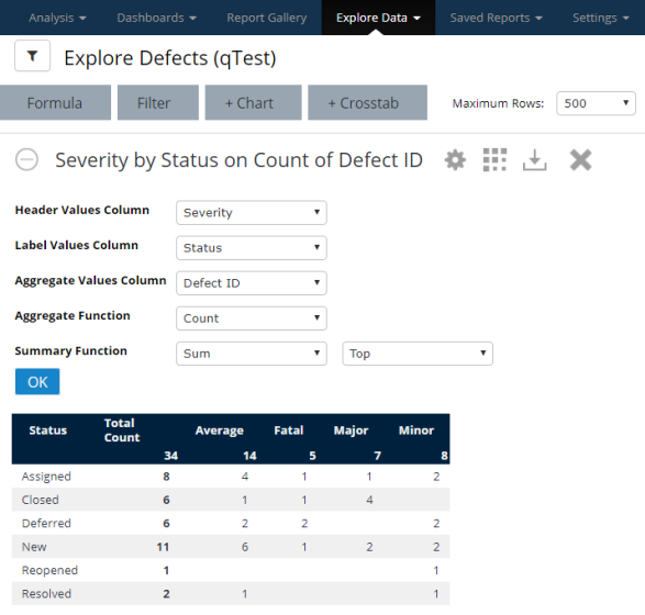
This example describes how to Build a Crosstab based on the number of Defects by Status and Severity. Follow these steps:
-
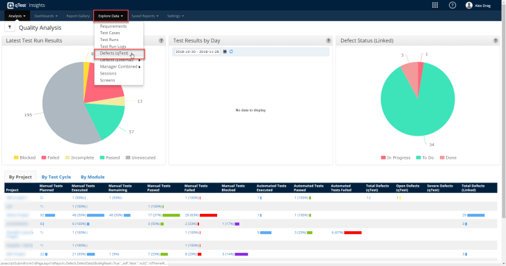
Under Explore Data section, select Defects (qTest) to open the Defect Data page.
-
The "Explore Defects (qTest)" page displays. Select the + Crosstab icon to start building the Crosstab.
-
Specify the following fields:
Header Values Column
Label Values Column
Aggregate Values Column
Aggregate Function
Summary Function
The example chart shows the number of qTest Defects by Status and Severity. -
Once done, select OK.
-
Optional: to view your Crosstab as a panel in the Dashboard Gallery, select the 9-box icon. Define your Panel Title and Panel Description. Select Done.
Create a Custom Formula
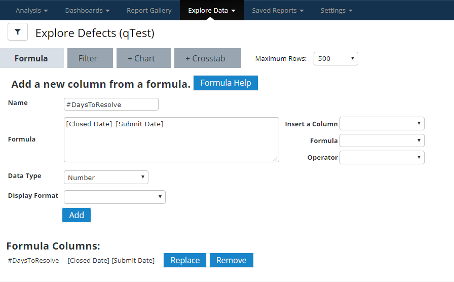
In this example, we want to Build a formula column named "#DaysToResolve" to calculate how many days it takes for a Defect to be solved.
-
Select Defects under Explore Data section to open the Defect Data page.
-
Select Formula to start to Build a new formula column.
-
Insert a column: select the Close Date, Submit Date
-
Formula: input the following expression and select Add.
[Close Date]-[Submit Date]
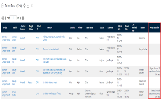
View the new column labeled "DaysToResolve" displayed as the last column in the data table.
Tips for Formulas
-
To do decimal arithmetic, you must explicitly cast the column data type to be a float instead of just an integer.
To calculate the percentage of not passing runs, a formula like "[Runs not passing]/[Total Run Logs]" will not work, and you should use the following: (Cast([Runs not passing] as float)) / (Cast([Total Run Logs] as float)) -
Explicitly define the date format in date_part function.
To get the year "2016" from a date "2016-10-07", use the following function, note that you need to specify the right date format (in this example: YYYY-MM-DD) date_part('year', to_date([Created Date], 'YYYY-MM-DD'))