RadioButton
This chapter includes detailed information on how to steer the control type RadioButton in TBox.
The following properties can be verified in addition to the general properties:
|
Property |
Description |
|---|---|
|
Label |
RadioButton name |
|
Selected |
Indicates if the RadioButton is selected or deselected. |
You can use ActionModes as described below. If you do not enter a property in the TestStepValue, the property from the Default property column is used:
|
ActionMode |
Value |
Default property |
Description |
|---|---|---|---|
|
Input |
<value> |
Selected |
Selecting a RadioButton |
|
Verify |
True, False, <property> |
Selected |
Verifying a value or property |
|
Buffer |
<property> |
Selected |
Buffering a value |
Control steering examples
The following examples illustrate how to steer the control type RadioButton.
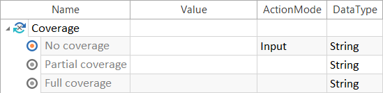
Selecting a RadioButton

|
The RadioButton No coverage is selected.
Selecting a RadioButton |
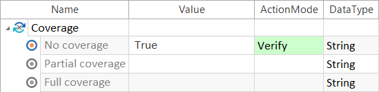
Verifying a property
|
|
The system verifies whether the RadioButton No coverage is selected.
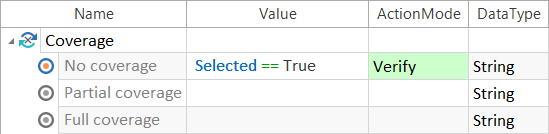
Verifying a RadioButton You can also use the property Selected to verify whether the RadioButton is selected.
Verifying a RadioButton by using Selected |
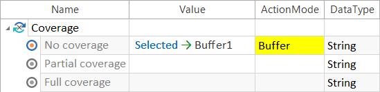
Buffering a property
|
|
Whether the RadioButton is selected (True) or not (False) is written to the buffer Buffer1.
Using buffers |