Steer WPF controls
You can create WPF Modules with Tosca XScan.
To do so, right-click on a Modules folder and select  Scan ->Application from the context menu. Alternatively, you can select a Modules folder and click Scan ->Application in the Modules menu. For further details on how to proceed from here, see also chapter "Scan Modules".
You can steer the following standard controls as described in chapter "Steering Controls":
The rest of this chapter explains how to steer controls that are specific to WPF applications.
ContextMenu
You can steer ContextMenus as described in chapter "Menu".
You can manually create a ContextMenu module by creating a module as described in chapter see chapter "Defining controls in cells" and modifying it as follows:
-
Set the BusinessType to "Window".
-
Set the InterfaceType to "GUI".
-
Add a Configuration Parameter called "Engine" with the value "DotNetEngine".
-
Add a BusinessID Parameter called "IsContextMenu" with the value "True".
-
Add a ModuleAttribute with BusinessType"Menu".
-
Add a Configuration Parameter to the ModuleAttribute called "BusinessAssociation" with the value "Descendants".
-
Add a Configuration Parameter to the ModuleAttribute called "Engine" with the value "DotNetEngine".
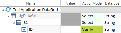
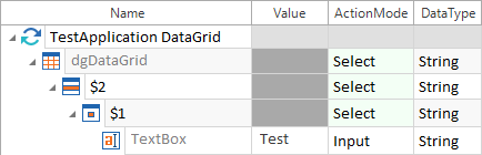
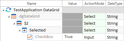
DataGrid
You can steer DataGrids as described in chapter "Table".
To steer controls within cells, use embedded controls (see chapter "Defining controls in cells"). You do not need to embed Link controls.

|
The example below verifies whether the value in the cell in the second row of the ID column is 1.
DataGrid: verifying a value The example below writes the value Test into the second row of the first column.
DataGrid: inputting text The example below selects the CheckBox located in the second row of the Selected column:
DataGrid: selecting a checkbox |
Editable ComboBox
Editable ComboBoxes are ComboBoxes that allow you to add entries to the list of options.
To add an entry to the list of options, follow the steps below:
-
Scan the WPF application with Tosca XScan.
-
During the scan, select the control named PART_EditableTextBox within the editable ComboBox control. If you do not see this control in the list, adjust the filter level.
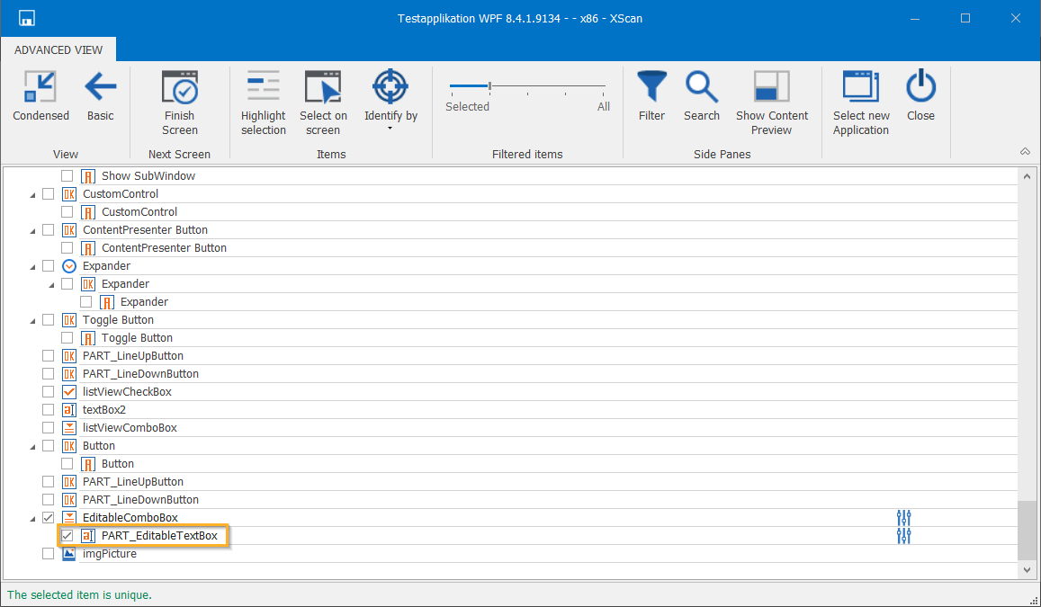
Select the control named PART_EditableTextBox
-
Save the Module.
-
In the TestCases tab, steer the TestStepValue named PART_EditableTextBox with ActionMode Input and DataType String. In the value, set the entry that you want to add to the list.
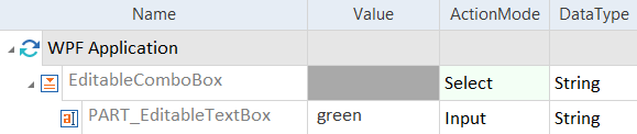
Steer the TestStepValue named PART_EditableTextBox
Expander
The WPF Expander is a collapsible/expandable container which can hold other controls.
To scan the content of an Expander, expand it before starting the scan.
In addition to the general properties, you can verify the following properties:
|
Property |
Description |
|---|---|
|
Label |
Expander name. |
|
IsExpanded |
Indicates if the Expander is expanded. |
You can use ActionModes as described below. If you do not enter a property in the TestStepValue, Tosca Commander uses the property from the Default property column:
|
ActionMode |
Value |
Default property |
Description |
|---|---|---|---|
|
Input |
Expand, Collapse |
|
Expand or collapse the Expander. |
|
Verify |
True, False, <property> |
IsExpanded |
Verify a value or a property. |
|
Buffer |
<buffer name> |
IsExpanded |
Tosca Commander buffers the value True or False depending on whether the Expander is expanded or collapsed. |
|
|
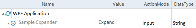
In this example, Tosca Commander expands the Expander.
Expand an Expander |
|
|
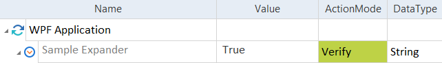
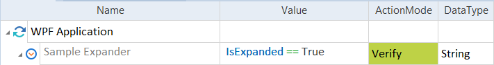
This example shows how to verify properties. In the screenshot below, Tosca Commander verifies whether the Expander is expanded (True).
Verify the state of an Expander You can also use the property IsExpanded to verify whether the Expander is expanded.
Verify the state of an Expander with IsExpanded |
|
|
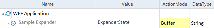
This example shows how to buffer the default property. Tosca Commander creates a buffer called ExpanderState. Depending on whether the Expander is expanded or collapsed at run-time, the system writes the value True or False to this buffer.
Buffer the state of the Expander |
Frame
A Frame is a panel that displays HTML content embedded within a WPF window.
The HTML content can be scanned and automated separately as described in chapter "XBrowser Engine 3.0". You should not specify a Browser test configuration parameter for steering this content.
To scan the HTML content, right-click on the WPF window during scanning and select HTML from the engine list.
ListView
A ListView is a type of ListBox that can have the format of either a list or a table.
If the ListView is in list format, you can steer it as described in chapter "Listbox".
If the ListView is in table format, you can steer it as described in chapter "Table".
PasswordBox
You can steer PasswordBoxes as described in chapter "TextBox".
You can input text into PasswordBox with ActionMode Input, but you cannot verify and buffer the content.
The default DataType for PasswordBox is Password.
|
|
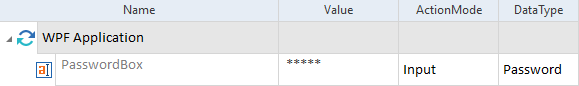
In this example, the engine inputs a password into the PasswordBox:
Input a password into the PasswordBox |
RibbonSplitButton
A RibbonSplitButton is a button with a drop-down menu beside it containing an arbitrary number of additional controls.
You can steer the controls inside the drop-down as described in chapter "Steering Controls".
|
|
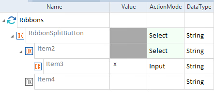
In this example, the engine performs an input on a button in the RibbonSplitButton's drop-down menu structure:
Steer a button in the RibbonSplitButton's drop-down menu |
RichTextBox
You can steer this control in exactly the same way as a normal TextBox (see chapter "TextBox").
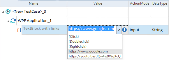
TextBlock
TextBlocks are blocks of read-only text.
To verify the text in the TextBlock, use ActionMode Verify.
The TextBlock can contain one or more hyperlinks.
To activate a hyperlink, select its associated URL from the drop-down in the Value column and use ActionMode Input.
|
|
In this example, the engine activates a hyperlink based on the selected URL:
Activate a hyperlink in a TextBlock |
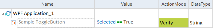
ToggleButton
You can steer ToggleButtons as described in chapter "Button".
To verify the status of a ToggleButton, use the property Selected.
|
|
In this example, the engine verifies whether the ToggleButton is selected in the test application:
Verify the Selected status of a ToggleButton |
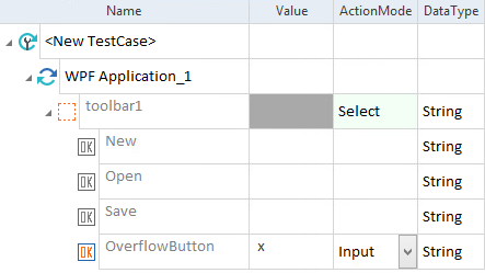
ToolBar
ToolBars are treated as containers that contain an arbitrary number of controls. You can steer controls inside the ToolBar as you normally would.
Controls in the ToolBar's hidden overflow area can be viewed in Tosca XScan by adjusting the Filtered items slider.
You can also steer the button that opens the overflow area.
|
|
In this example, the engine performs an input on the ToolBar's overflow button:
Steer the overflow button on a ToolBar |